Studio Motema
Role: Lead Designer & Developer
Timeline: 1.5 weeks
Scope: Full site design, UI/UX, interaction design, responsive build
Creative Direction & Aesthetic Choices
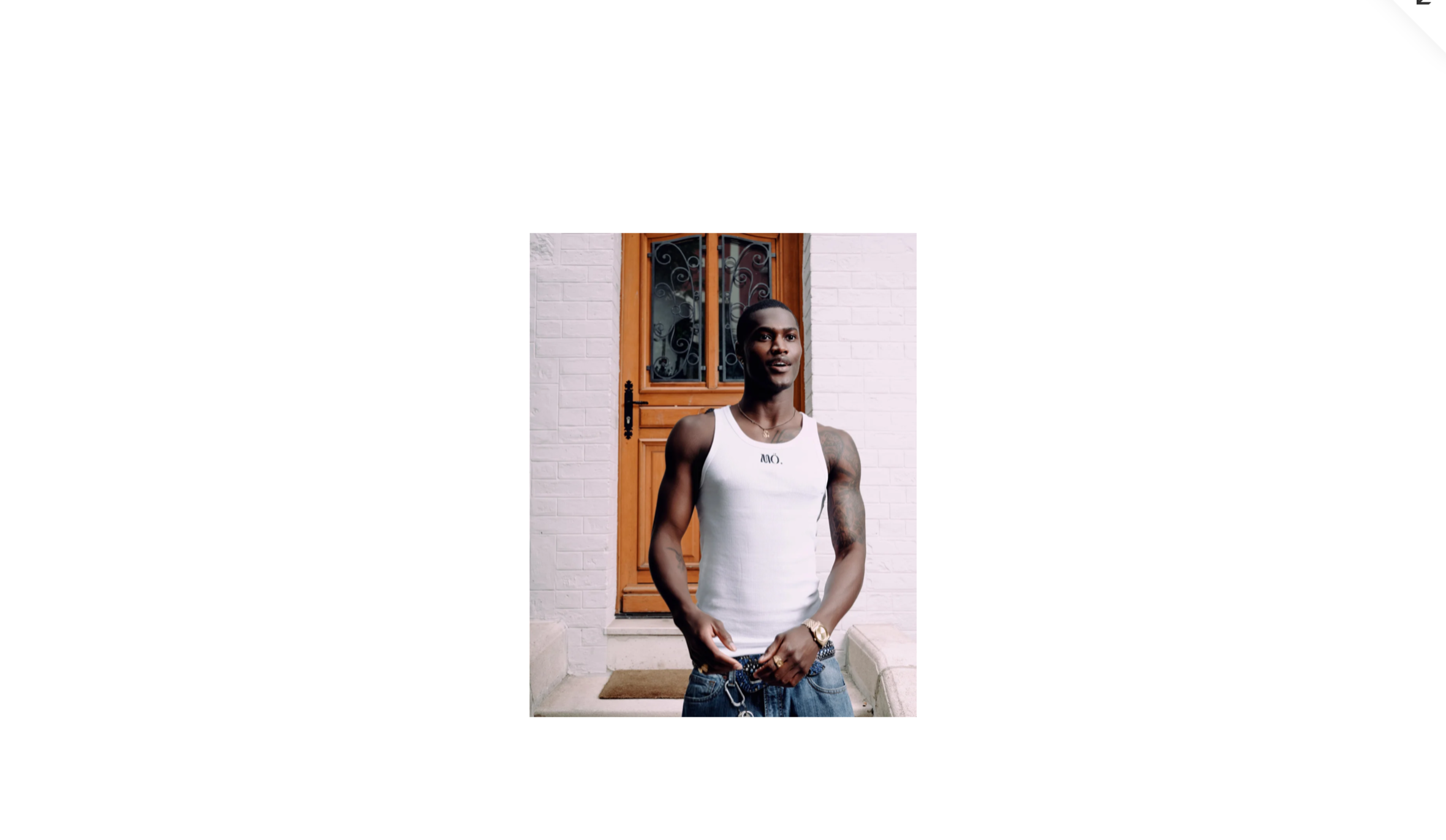
When approaching the Studio Motema website, my goal was to craft a space that felt as refined and thoughtful as the brand itself—rooted in culture, creativity, and clarity. I leaned into a clean, editorial layout that prioritises strong visuals and structured typography, allowing the work to speak for itself while creating moments of softness and elegance throughout.
The palette is intentionally monochrome with warm, golden undertones, reflecting both sophistication and quiet luxury. White space is used generously to give rhythm to the scroll, making every project feel curated and digestible. The type hierarchy is clean, modern, and non-invasive—designed to support the visuals, not compete with them.
I kept the site intentionally content-forward and minimal in navigation, echoing the studio's calm confidence. The decision to build interaction subtly—hover overlays, smooth fades, and seamless page transitions—was made to add a layer of modernity without overwhelming the viewer.
Interactive Elements & Custom UI Decisions
One of my focuses in this build was micro-interaction. Instead of flashy animations, I introduced custom hover effects that give life to buttons and images, creating tactile feedback that draws users in. Each page loads with gentle transitions to mirror the intentional pacing of a gallery or exhibition.
Menus were built with a top-level hierarchy that’s always accessible but never obtrusive, allowing the work to remain centre stage. I coded the image gallery sections to scale responsively, ensuring the layout adapts beautifully across devices—from wide desktop screens to mobile scrolls.
I also incorporated a few bespoke design touches like softened image frames and gentle gradient overlays in key sections, to add a subtle handcrafted feel, echoing the creative nature of the studio.
Timeline & Execution Strategy (1.5 Weeks)
This build was fast-tracked without compromising quality.
Days 1–2: Rapid wireframes and brand tone definition. I worked closely with the studio to distil their aesthetic into a visual language we could scale.
Days 3–5: High-fidelity mockups across homepage, projects, and navigation. I also prototyped all interactive states to make sure every detail—from hover behaviour to mobile menu flow—was precise.
Days 6–10: Full front-end development. I built the site with performance and responsiveness at the core, optimising images, layering interactions, and refining load times and transitions. We launched with a soft QA pass to ensure consistency across browsers and devices.
Design Philosophy Behind the Build
This site was designed to feel like walking into a well-curated studio space—intentional, quiet, but undeniably confident. The restraint in colour, the precision in spacing, and the light interactivity were all chosen to reinforce the studio's authority and taste without ever shouting for attention.
By stripping back and focusing on craft, I gave the brand a platform that both celebrates its work and builds trust through visual discipline.