Introducing
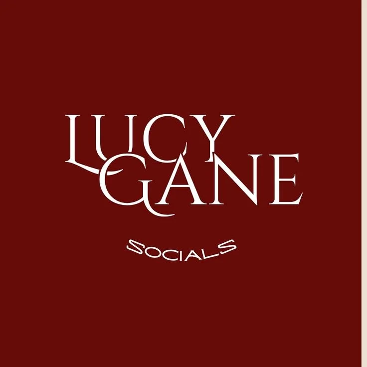
L.G.S
lUCY GANE SOCIALS
FULL BRAND IDENTITY
BRAND IDENTITY LOGO DESIGN PACKAGING

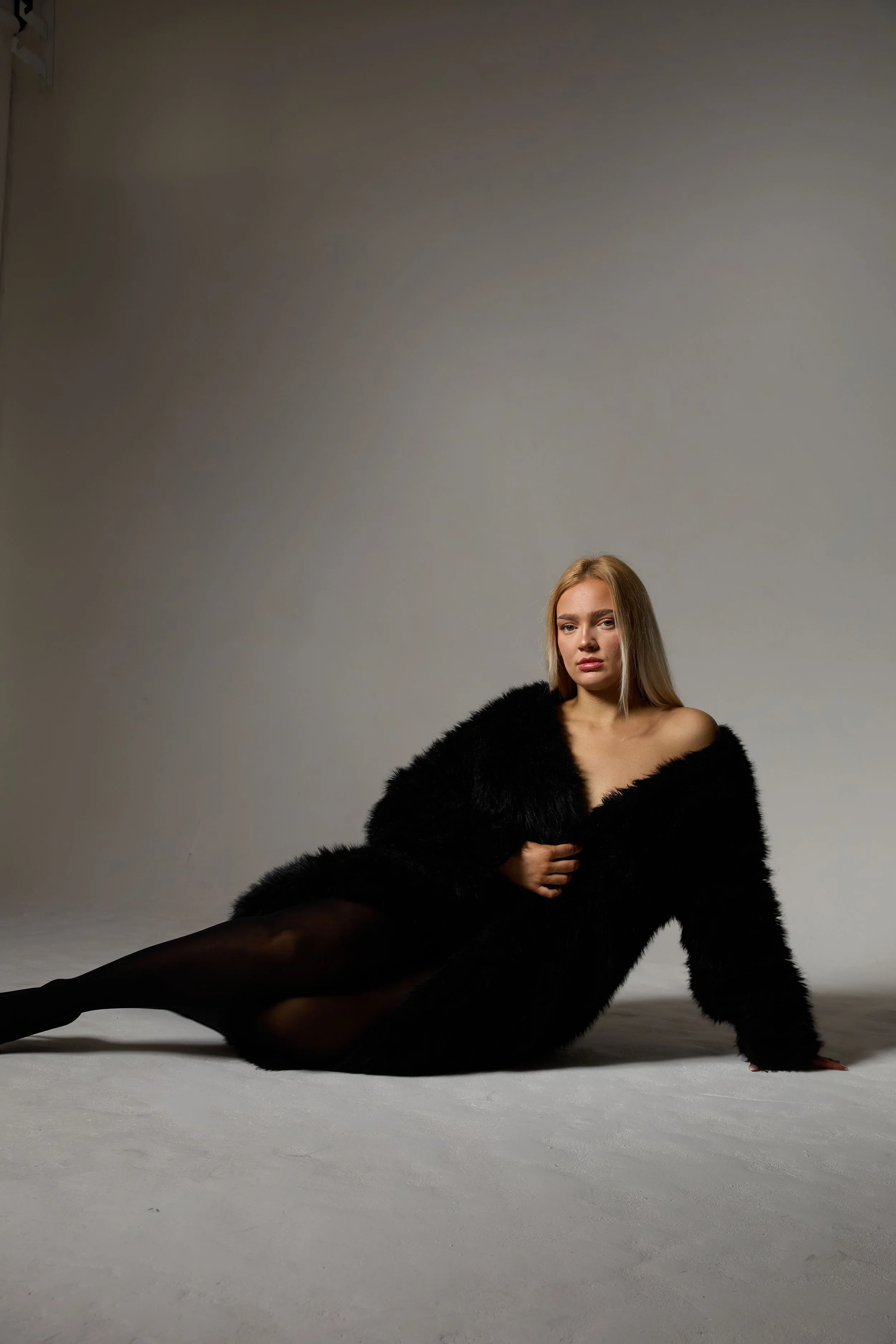
LG Socials rebrand was crafted to elevate Lucy Gane as a content powerhouse—straddling both authority and approachability through a deliberate masculine–feminine visual balance.
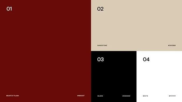
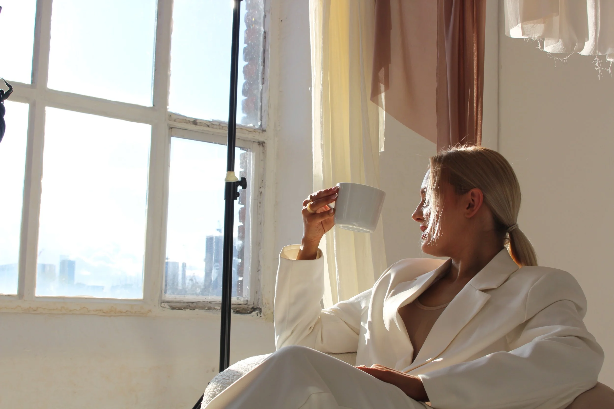
The palette Centres on deep maroon and black for strength and gravitas, complemented by cream, butter yellow, sky blue, and white for a lighter, airy contrast. Recurring motifs of cream-and-gold accents weave through the identity, evoking luxury, heritage, and regality. This duality positions her not just as a strategist and studio head at Spot 101, but as a curator of creativity who commands respect and inspires with finesse.

Building on this foundation, the rebrand extends into a layered, flexible identity system that reinforces LG Socials as both authoritative and artful.
Logo & Iconography: The monogram “LG” is crafted in bold maroon with refined gold flourishes, combining the solidity of black grounding with airy cream outlines. Custom icons—such as a stylized quill pen, content grid, studio spotlight, and regal frame—use butter yellow and sky blue highlights to bring playful lightness and creative energy.
Visual Toolkit & Textures: Textured maroon gradients and subtle gold foil patterns overlay creamy backdrops across digital and print touchpoints—website headers, proposal decks, social graphics, and client presentations—evoking a tactile sense of luxury and timelessness.
Marketing Strategy & Applications: On Instagram and LinkedIn, the new identity comes alive through elegantly curated carousels and highlight cover bundles featuring cream backgrounds with gold framing. Posts blend bold headlines in maroon with light-hued testimonials and client spotlights in butter yellow and sky blue accents—striking a balance between strength and warmth.
Through all touchpoints—Spot 101’s 360° branding, studio positioning, and client-facing content—the rebrand conveys that LG Socials is not just a manager, but a refined authority in content creation and brand storytelling, wrapped in a signature blend of power and elegance.