Introducing
kairo’s kitchen
FULL BRAND IDENTITY
BRAND IDENTITY LOGO DESIGN PACKAGING

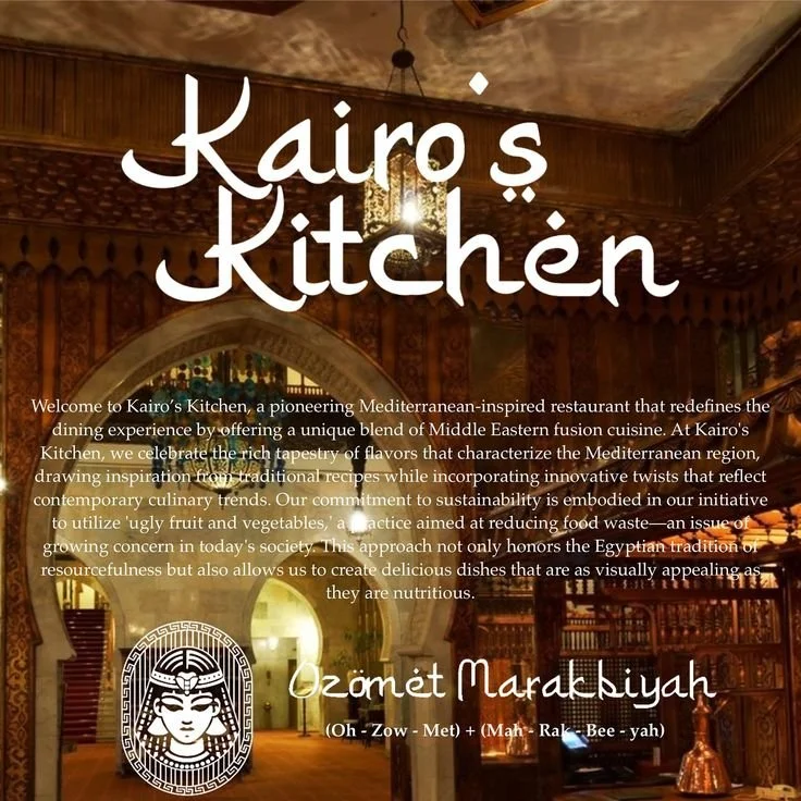
Kairo’s Kitchen is a Mediterranean-inspired restaurant and lounge built on the heart of Egyptian hospitality—Ozomet Marakbiya, a tradition rooted in generosity, warmth, and open-hearted service. The brand draws heavily from regional visual heritage, using hand-drawn Mediterranean iconography to create a playful yet deeply cultural identity.
Core colours include charcoal black, symbolising the smoke and coal of open-grill fire cooking, and regal golds, creams, and ochres, echoing Egypt’s rich historic elegance. Accents of olive green and sun-dried red nod to native flora and the warm earthiness of ingredients like olive oil and sumac—making the visual language feel both timeless and alive
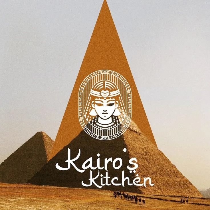

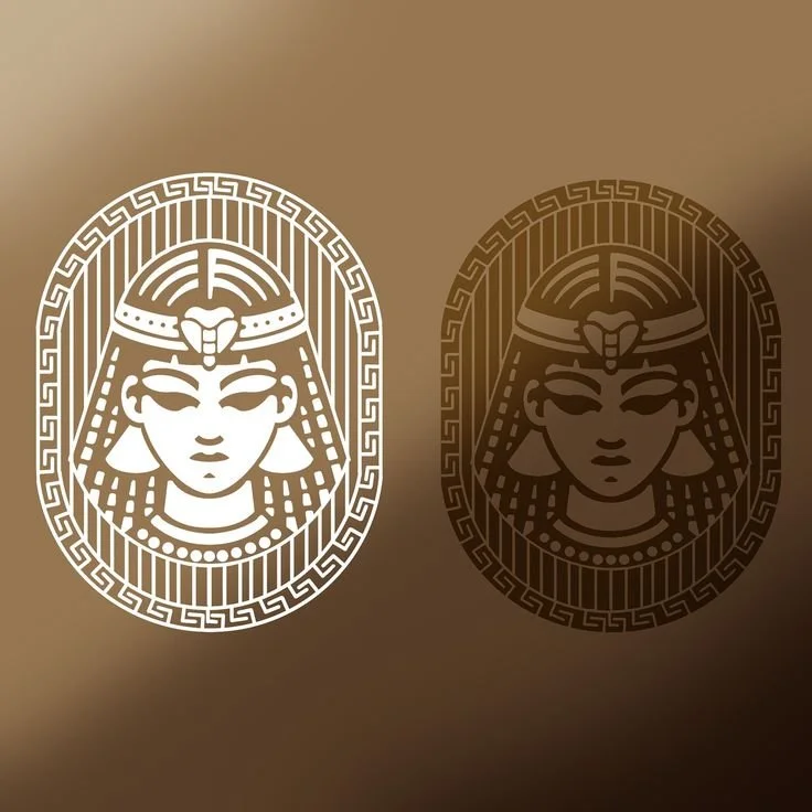
The branding system for Kairo’s Kitchen is designed to immerse guests in a fully sensorial experience—where every visual cue reinforces the restaurant's deep cultural roots and its promise of trust and hospitality. The logo features a custom serif inspired by ancient stone carvings, with subtle ligatures that mimic hand-drawn inscriptions found in Mediterranean ports. Illustrative motifs—from clay pots and date palms to grilled fish and market spices—are rendered in sketched textures and used across menus, signage, tableware, and packaging to invite guests into a story of shared meals and timeless tradition.
The colour palette is where the identity truly shines: charcoal black evokes slow-roasted meats over coals, while gold, cream, and ochre capture the opulence of Egyptian interiors and sun-washed courtyards. Olive green and warm red inject earthiness and vitality, reinforcing the authenticity of ingredients and customs. From digital menus to ambient social content and environmental branding, Kairo’s Kitchen crafts an elegant, soul-warming space that feeds both body and memory—turning first-time guests into lifelong patrons.