Introducing
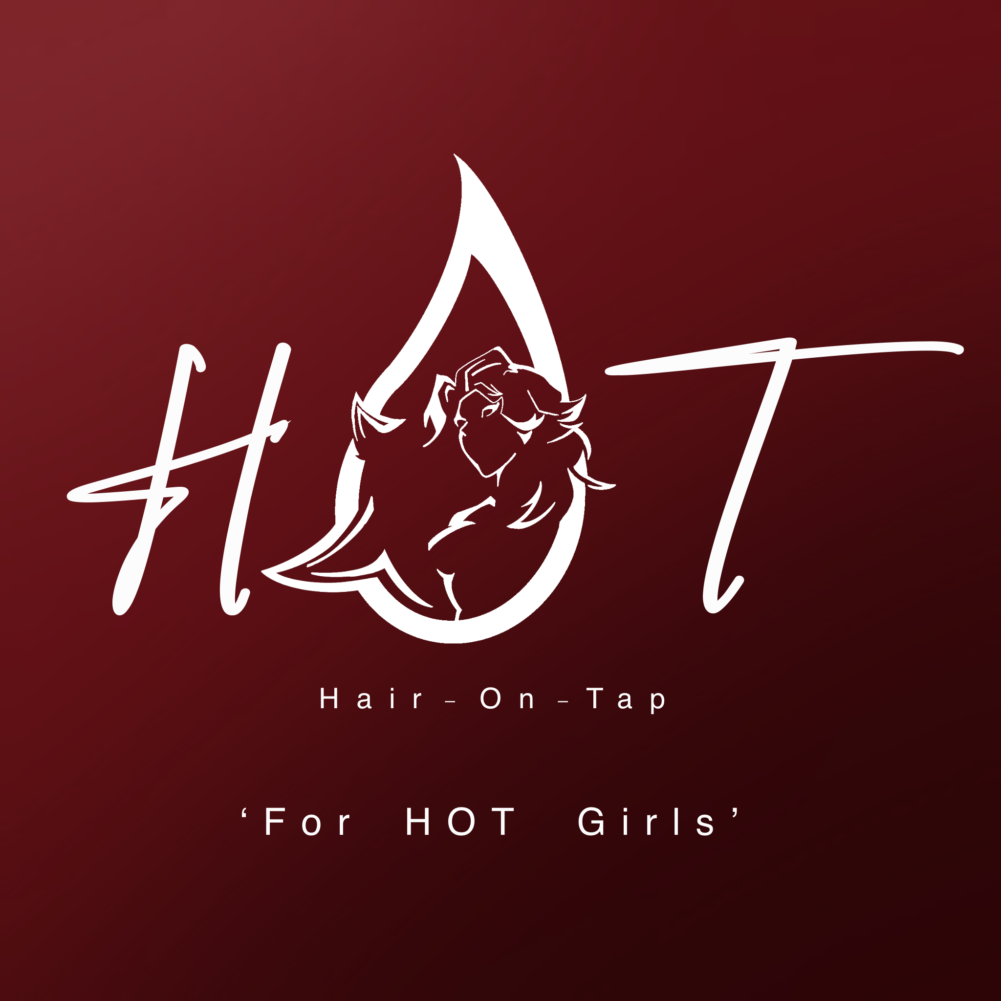
H.O.T

HAIR-ON-TAP
FULL BRAND IDENTITY
BRAND IDENTITY LOGO DESIGN PACKAGING
H.O.T (Hair On Tap) is a conceptually bold hair dispensary brand commissioned by artist Amatiime, drawing direct inspiration from the fiery, feminine energy of her single “Shot Caller.”
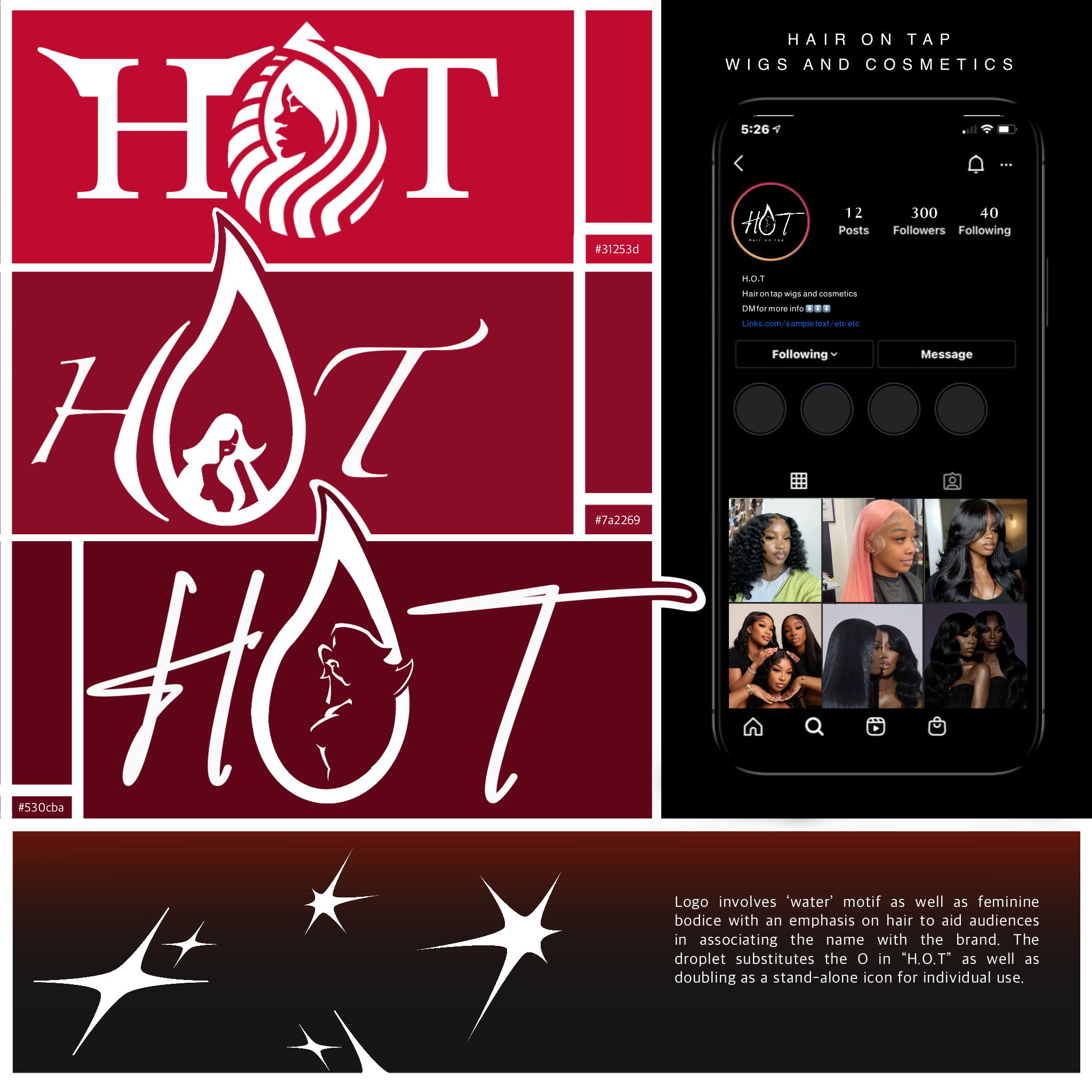
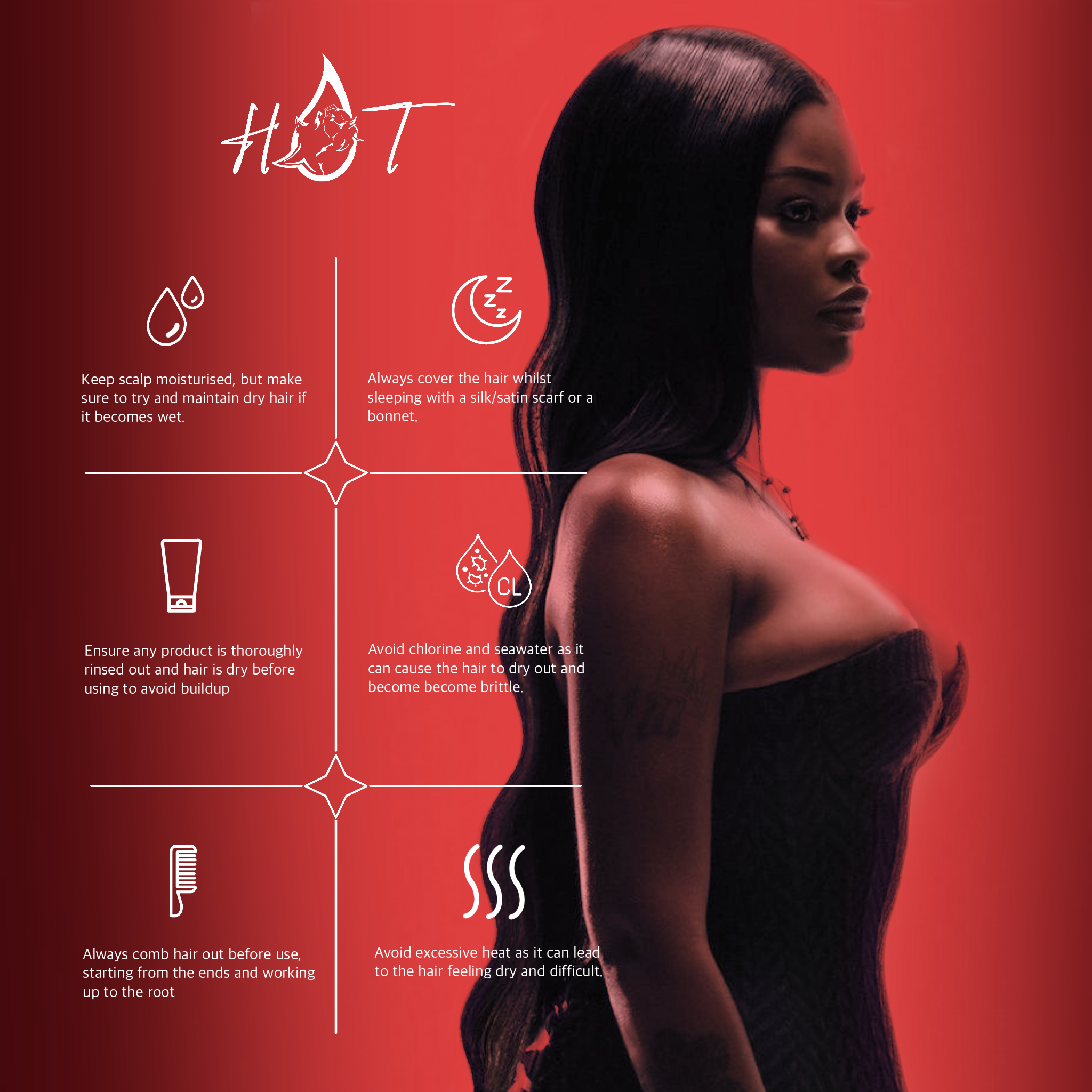
The identity plays on dual themes—fire and water—manifesting in visuals like a flaming water droplet and fluid, hair-like gradients. Core brand elements include strong wig and raw hair motifs, black-red-white color schemes, and custom icons that mirror the confidence and flair of the track itself. The brand merges music, beauty, and heat into one unapologetically vibrant identity that screams both style and strength.
This brand was all about energy—visual, cultural, and social. I extended H.O.T’s aesthetic into a full identity system: a logo mark shaped like a water droplet engulfed in flame, referencing both the “tap” and “hot” themes. Custom-designed icons, playful line art, and bold red-to-black gradients gave the packaging and digital presence a sense of rhythm and heat, echoing the tone of Shot Caller’s cover art.
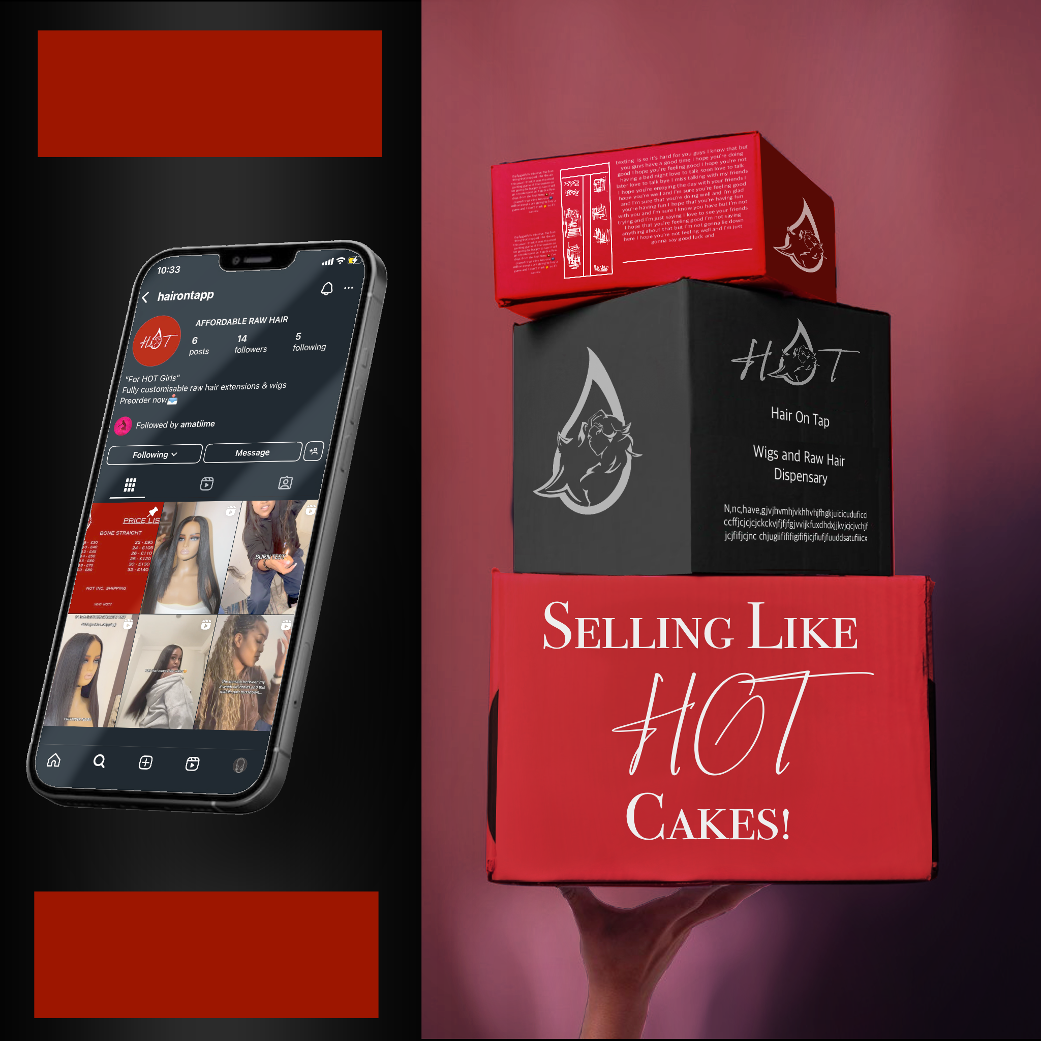
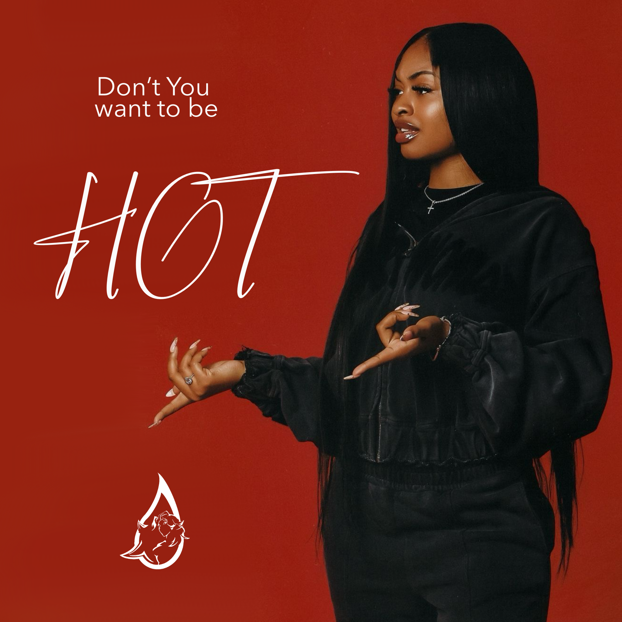
On social media, we leaned into hyper-stylised motion graphics, meme-culture layouts, and product shots that balanced glam and grit. Story highlight icons were custom-made to resemble silk presses, hot combs, and wig tags—every detail reinforcing H.O.T’s core identity as both a hair brand and an artistic statement. Packaging was designed with shelf appeal and shareability in mind—clean, contrast-heavy boxes and pouch bags that stood out in salons and Instagram feeds alike. The result? A brand that doesn’t whisper beauty—it shouts it.